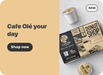
Understanding H-E-B® Banner Components

Retail Media campaigns at H-E-B® contain various banner types depending on the media plan. No one banner is the same size, but almost all banners share similar foundations which include Typography, Call to Action Button, Background Color, Creative Image Area, Legal, and Logo/NEW pill placement. Understanding these foundations is the first step to designing a cohesive retail media campaign that speaks to the H-E-B customer. Refer to this section of the guide for overarching design principals of retail media campaigns at H-E-B®.
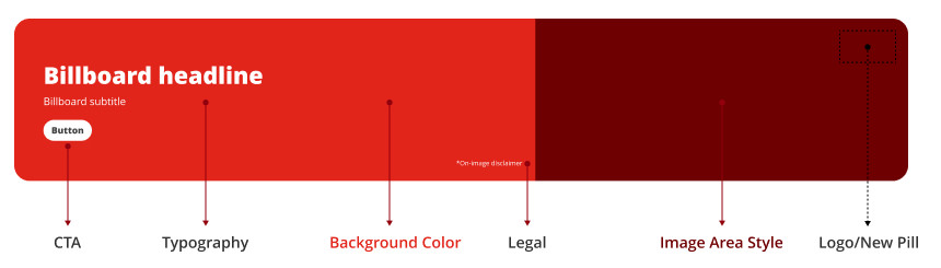
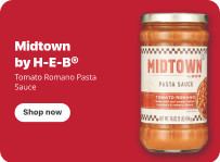
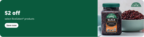
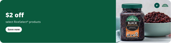
Banner anatomy: CTA, Typography, Background Color, Legal, Image Area Style, Logo or NEW pill

Typography Color Options

  •  
    Buttercream#FFFFFF
  •  
    Cold brew 800#414142

Call to Action (CTA) Button Options

When a banner has a CTA button use the following options

Shop nowSave now
  •  
    Buttercream#FFFFFFPill Color
  •  
    Cold brew 800#414142Copy Color
Shop nowSave now
  •  
    Cold brew 900#333333Pill Color
  •  
    Buttercream#FFFFFFCopy Color

Copy Guidance

General Copy Guidance

Do ✅

  • Write for the smallest screen. Copy must be consistent across desktop, tablet and mobile. Although it may seem like there is large negative space on desktop, most customers are on mobile, so write for mobile and duplicate on desktop.
  • Use sentence casing for headlines, body, and button copy.
  • Left-align copy to the margin.
  • Continue a sentence (including casing) if your phrase starts in the title and continues in the subtitle.
  • Focus on either offer messaging or brand messaging, but do not include both.

Don’t 🚫

  • Max out character limits. When maxed, the messaging becomes unclear.
  • Use punctuation.
  • Use all caps for button text.
  • Center-align copy.

Examples

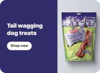
Short headline, sentence case, left aligned desktopDesktopShort headline, sentence case, left aligned mobileMobile
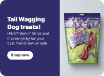
Maxed-out copy, punctuation, title case desktopDesktopMaxed-out copy, punctuation, title case mobileMobile

Copy guidance for offer messaging

Savings are the most exciting part of offer messages to our customers, so they should be displayed most prominently in the visual block.

How to write offers

  • Headline = discount (what do I get?) + discounted item(s)
  • Subtitle = condition (what do I have to do?)

Do ✅

  • Focus on the discount most prominently, followed by the condition.
  • Always capitalize FREE.
  • Use a plus sign “+” if you need to say “or more” after a number.

Don’t 🚫

  • Include end dates and offer details within creative. This lives in the clickthrough experience.

Examples

Discount first, condition in the subtitle desktopDesktop
Brand headline with the offer buried in the subtitle desktopDesktop

Background Color Guidance

Do ✅

  • Use solid colors that enhance the products/imagery featured.
  • Ensure enough contrast between copy and background to be 508 compliant.
  • Avoid using mid-tones and neon colors. They de-emphasize products and text, look muddled, and are often not 508 compliant.

Don’t 🚫

  • Use texture, patterns, or gradients.
  • Use white, grey, or black as your background color.
  • Use multiple colors.
  • Use a lighter shade in an angled diagonal shape.

Examples

Solid color with strong contrast desktopDesktop
Patterned background desktopDesktop

Approved Dedicated Email and Friday Feature Email Colors

  •  
    H-E-B Red Email#DC291E
  •  
    Dark Wine#69022F
  •  
    Grayish Violet#A48EB5
  •  
    Soft Pink#EA5B87
  •  
    Pale Pink#FCC8E8
  •  
    Cobalt Blue#0965AB
  •  
    Dark Desaturated Blue#3A5162
  •  
    Dark Blue#004F6E
  •  
    Dark Cyan#004D46
  •  
    Desaturated Cyan#5EB0BA
  •  
    Cyan#00AEDF
  •  
    Light Orange#FDF6E7
  •  
    Cream#F9F7F0
  •  
    Light Gray#F3F3F3
  •  
    Vegas Violet#11034C
  •  
    Raven’s Banquet#B92255
  •  
    Purplex#631C84

Image Area Style Options

There are three banner style options to choose from when constructing a campaign. Choose one of the three options that will replicate across all banner sizes within the campaign.

1. Product Knockout

  • Features product knockout on a one-color background, with darker tone diagonal
  • Background Color Area: Solid one-color, 508 compliant
  • Image Area: Features 1-3 branded product package knockouts on a solid color with darker tone diagonal
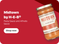
Product knockout desktopDesktopProduct knockout mobileMobile

2. Lifestyle Imagery

  • Background Color Area (Area behind the copy and/or CTA Button): Solid one-color, 508 compliant
  • Image Area: Features 1-3 branded product packages set in a realistic lifestyle setting
  • People should not be featured in imagery
Lifestyle imagery desktopDesktopLifestyle imagery mobileMobile

3. Product Knockout + Lifestyle Imagery

  • Background Color Area (Area behind the copy and/or CTA Button): Solid one-color, 508 compliant
  • Image Area: Features 1-2 branded product package knockouts overlayed on top of 1 lifestyle image
  • The lifestyle image should be a beauty shot of the product without any branding (example: Plate of Pasta, Counter top with Sponge, etc.)
  • People should not be featured in lifestyle imagery.
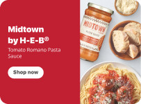
Product knockout with lifestyle imagery desktopDesktopProduct knockout with lifestyle imagery mobileMobile

Logo Placement

  • Place the brand logo in the top-right or bottom-right corner of the banner.
  • Stay within the max logo width and height listed below.
  • Ensure there is enough contrast.
  • Some banners cannot support a logo because of their size or UX restrictions.

Logo area

Every banner has one logo area, 145 x 55px on desktop. A second logo shares that same area. The area does not get bigger.

BRAND
145 x 55px max (desktop)
20px from edges
Image area

Desktop: 1 logo can use the full 145 x 55px area.

PARTNERBRAND
145 x 55px max (desktop)
20px from edges
Image area

Desktop: Supplier logo on the right, partner logo on the left. Match their visual weight, not their pixel size. Keep at least 10px between them. Both stay inside the 145 x 55px area.

PARTNERBRAND
100 x 55px max (tablet)
20px from edges
Image area

Tablet: 2 logos share the 100 x 55px area.

BRAND
40 x 40px max (mobile)
20px from edges
Image area

Mobile: 1 logo only.

Logo area sizes
Banner size Logo area (Figma) Logo area (Photoshop) Inset Logos allowed
Desktop 1376×250 145 x 55px 290 x 110px (2x) 20px 1, or 2 by partnership exception
Tablet 976×250 100 x 55px 200 x 110px (2x) 20px 1, or 2 by partnership exception
Mobile 343×250 40 x 40px 120 x 120px (3x) 20px 1 only

Mobile (343×250) supports 1 logo only. A partnership logo moves to the clickthrough.

Applies to Billboard, Coupon, and Brand Page + End Cap Hero banners. Check each placement page for other banner types.

Examples

One logo in the logo area desktopDesktopOne logo in the logo area tabletTabletOne logo in the logo area mobileMobile

How many logos

Standard1 logo

Every banner. One supplier logo in the logo area.

Exception2 logos

Supplier plus an organization it has a legal or contractual partnership with, such as a league, event, or charity.

Approval required3+ logos

Must be approved by HRM AM leader before contracting and creative development.

What counts as a partnership

Qualifies ✅

  • Supplier plus a league or event partner, such as the NFL, NCAA, FIFA, or the Olympics.
  • Supplier plus a charity partner, such as March of Dimes or Operation Homefront.

Doesn’t qualify 🚫

  • Two retail brands co-branding, such as a snack brand and a beverage brand.
  • More than two logos without exception approval.

Examples

Supplier and partner logos sharing the logo area desktopDesktopSupplier and partner logos sharing the logo area tabletTablet
Too many logos desktopDesktop

Logos never sit outside the logo area. No extra logos in the copy area or image corners.

Logos by placement

Placement Logos allowed Notes
Billboard, Coupon, Brand Page + End Cap Hero 1, or 2 by partnership exception Mobile: 1 logo only.
Intra-grid 1, or 2 by partnership exception 2 logos on desktop and tablet only. Mobile: 1 logo only.
Offsite 1 on the larger sizes No logo on 320×50.
Weekly email None No supplier logos.
Homepage None No supplier logos.

Need more brand presence? Additional logos can go on the clickthrough landing page. Every banner, including the End Cap Hero, follows the logo limits above.

H-E-B logo on co-branded placements

Applies to Offsite, Pinterest, Fuel Pump, and any banner that carries the H-E-B logo.

The H-E-B logo size is fixed for each placement. Don’t shrink it to make a supplier or partner logo look bigger.

The only exception is a signed partnership contract that sets the logo sizes, such as the NFL or FIFA. The AM must confirm the contract terms in the Workfront request before design starts. A request from the client alone is not enough.

If a supplier wants more brand presence, make their logo larger within its own logo area, or move extra branding to the clickthrough.

New Items Pill

  • A NEW pill can be used to flag new products or offers on a banner
  • The NEW pill is placed in the top-right corner of the banner
  • The NEW pill is used on its own and cannot be used in conjunction with brand logos
NEW pill filePNG
NEW
  •  
    Buttercream#FFFFFF
  •  
    Cold brew 800#414142

Examples

NEW pill in the top-right corner desktopDesktopNEW pill in the top-right corner mobileMobile